Temperature Test 1
Blue and Orange Objects
Firstly I began by testing temperature. I chose to use the coolest and warmest colour on the colour wheel, which is blue and orange. Blue is the coolest, orange is the warmest they are equidistant on the colour wheel. I decided to measure them against white and black, the lightest and darkest colours on the colour wheel.
I started off with a black and white background,

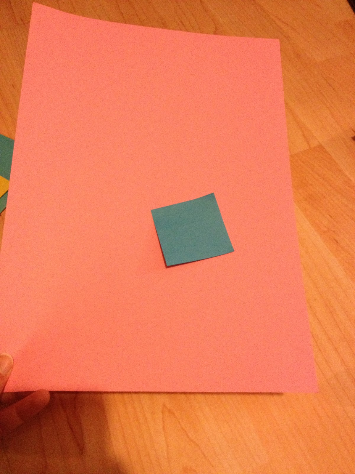
At first I wanted to see what my colours where to begin with and so I chose a neutral mid-tone background.
Orange (below) is very bright , there is a yellow hue in this orange and it is quite saturated, perhaps not a pure orange. I would say it is a warm colour.

The blue object is quite a light tint of blue, however it is saturated and if anything leans towards a slightly more green hue. Definitely a cold colour.

When I put the orange object onto the white background I think the orange looked cooler than it did on the grey, this is because orange is closer to white on the greyscale colour wheel, and white and orange are both light/ warm colours and therefore they seem to cancel each other out.

Then when I placed the orange object onto the black paper the orange became more contrasting in its temperature compared to the grey and white background, this is because they are opposites on the colour wheels and so they have more of a contrast. And so orange looks the warmest on black paper.

I then tested out this idea with the blue object , when I placed it on the white background the blue looked more saturated and so this brought out the coolness in its colour. As white and blue are opposite. However I think that because this is a lighter blue this may of been more obvious with a darker shade of blue.

On the black paper the blue still stood out but not as much so as the white, the black seems to absorb the colour of the blue and I would say it appears to be a different shade of the original blue we saw. However it still looks cool and I think this is down to the tint of blue. And so the orange object I experimented with was a more successful contrast of temperature.

Temperature/ Tone Test 2- Reversed
Black and White Objects
However I decided to re-test this contrast of temperature but this time I used black and white objects.
As you can see below black is most contrasting to white and white is more contrasting against black.


So I decided to test the objects on blue and orange paper, below when the white box is on the blue paper, the white looks like a very light white, and the paper looks like a very cool blue and so they intensify each others temperature and tone qualities as they are opposite. When the white box is on the orange the box looks like shade darker than the same box on the left. I would also say that the box and the orange paper both look warm, and there isn't a high contrast.


Then when I tried the black box on the blue and orange paper the opposite happened. On the blue paper the box seems to desaturate the paper and the blue almost looks warmer, this could because black is the darkest colour. However on the orange paper the black looks more of a pure black and it is very intense, It also shows that the orange is very warm.


Contrast of Saturation Test 3
Blue
I decided to test the saturation of blue, when you put a blue object onto another what happens to its saturation.
I began with this bag, that is almost a pure hue of blue,

I then chose to use this folder which has a slight green hue and it seems to be a lighter tint of the blue above.

I then put the two together and they both seemed to make each other look more saturated, I would say that the bag now almost seems to have a purpler hue in it.

I then added a less saturated but darker shade of blue paper to the bag/folder. It was obvious that the paper was the least saturated, but I would say it drew some of the saturation out of both the folder and the bag.

this is the most blue/green blue of all the objects, I would also say it is the lightest.

When I placed it next to the bag it made the seem a lot more saturated and the post it note looked slightly less saturated compared to the bag.

On the folder the post it note really intensified the green hue in the folder, it also makes the folder looks more desaturated than itself, and I would say that the post it note doesn't look to have as much of a green hue because the folder has a higher hue of green within it.

And when I put the post it note onto the blue paper, it looked highly saturated more so than when it had previously and the paper looked more desaturated and even a deeper shade than it had previously.

I then placed all four of the paper materials together and I would say that the paper looks the least saturated then the folder, then the post it note and the bag looks like the most saturated colour of blue present.

I also tried a blue object on the bag, folder and paper.
On the bag the object looked less saturated than the bag.

On the paper the object looked more saturated and the paper desaturated.

And on the folder the colours almost matched each other and so there isn't really a clear desaturation in either. If anything the object looked like a slightly darker shade and the folder looked more tinted.

Simultaneous Contrast Experiment Test 4
At first I began with blue and orange, however as they are complimentary colours nothing really happened. I placed the post it notes like this as you need to have a small gap between the colours to let them manipulate each other.

And so I but the notes onto a red background, as you looked at them the edge around the post it note seemed to me to go purple, this could be because my eyes mixed the two colours together. But I also saw that the blue post it notes began to go green and this is because red is trying to bring out its complimentary colour- green from the blue. And even looking at this photo the red background looks very orange even though the paper was red.

Then I placed the blue post it notes onto yellow paper. As you look at the yellow background seems to turn more orange especially around the outlines.

I then put a series of blue and green post it notes together, if you look at them they seem to vibrate and almost become 3D which means they are fighting against each other.

I then tried green and yellow post it notes together. I think that these two seem to contrast less than the previous blue and green contrast. I think that this is because the green post it note has a slight yellow hue.

I then made the post it notes into a 3D structure to see what happened, the green appeared to be more yellow, and I seem to be able to see purple, this could be because green has a higher frequency to blue and greens complimentary is red, green is looking for red and blue and red mixed make purple.

I tried this again with the other series of notes however nothing interesting happened with these again the green appeared more yellow.

I then tried all three colours together as a series to see if they would contrast however they do seem to irritate your eyes when you look at them but I do not think they bring out any other colours as there is already a lot of information going through the eyes and this is why they almost hurt to look at as there is a lot to process.

Tint Experiment Test 5
The green post it note is perhaps already a tint of green itself. It appears quite light/white.

Firstly I began with green, as you can see below the post it note is clearly a less saturated tint of the colour beneath it.

Even on another surface the post-it not looks like a tint of the one underneath it.

Again it looks tinted and desaturated.

However I ran out of the colour green and so I switched to yellow. As it is already the closest colour to white.


The right piece of paper is a tint of the left, it is a lot lighter, closer to white.

I then tried the theory out with objects. In the photograph below I would say there is no obvious tint. But when I could see it in front of me the paper below did look a lighter tint than the car sponge. This is because the sponge was a purer hue of yellow.

Again on the next piece of paper, the paper is a tint of the car sponge. This contrast is higher than the one above as this piece of paper looked like a tint of the piece above.

I would say there is no apparent tint as the colours are very similar.

I then tried these papers again but with a post-it note. Again the paper is a lighter tint that the note.

However on this piece of paper the note is a tint of the paper.

And so i put the note up against the sponge. And there is hardly any difference in tint, but I would say that the post it note is slightly lighter.

Complimentary Contrast Test 6
Green and Red
I began with the red and green paper. This red looks less saturated, and has a slight blue hue. The green in contrast is more saturated but it too has a blue hue.
Both are also quite cool and both are quite dark tonally.

When I placed the red object onto the green paper it seemed to make the object very vibrant and almost a pure red hue. This is because greens complimentary is red and so the red has become more red.

I then took two different red and greens. Which are both more yellow, and orange, tonally lighter, warmer in temperature and more saturated.

And so when I put the red object onto this green the object became more orange as the green had a higher hue of yellow within it.


The difference of light Test 7


With a different light , the torch which is a lot 'whiter' more intense and closer to the source. The yellow of the ball is a lot more vivid/intense. There isn't really a change in hue, I would say tonally its darker.


The orange object now looks more yellow I would say, this could be because the light source is more white than the previous light source which has an orangey/yellow tint to it.


Again this red now looks more orange, I am thinking that it is for the same reason as above except it appears orange as red is further away from yellow. I would also say the object looks warmer in contrast, this could be because of the more orange hue.


I think that the green in the torch light source also looks to have a more yellow hue. Whereas previously I would of said it was had a bluer-hue, and was a more pure green.


However in the last experiment with the blue post it note. The blue in the bottom image (the torch) looks more saturated than the one above, I think that this is because the light source is more white and therefore the blue looks deeper, cooler.
Experimenting with 'RGB' and 'CMYK' colour Test 8
I firstly chose colours that represented CMYK.

And then colour RGB, red, blue and green

I then chose objects that where RGB


I decided to experiment with the colour purple, looking at its contrasts. I firstly began with the colour yellow as it is equidistant to purple, and its its complimentary colour.
This purple is very dark tonally, and I would say it has a slightly more red hue as opposed to blue.

The properties of the purple does not change really against a different yellow, which is paler and more green.

Again this yellow does not really change the colour of the purple.

And so i changed the colour, against the green the purple appears lighter and more red this is because the green is trying to impose its complimentary colour- red in the purple, and as the purple already has a slightly red hue this is more emphasised.

When you place it against the orange the purple doesn't seem to change, this could be due to the fact both colours are quite warm in temperature.


The egg box...
Is greeny blue against the neutral paper because it has a bluer hue within it. And it appears to have a medium/high saturation of colour.

Against the orange, the colour of the box looks warmer as greens contrasting colour is red which is close to orange on the colour wheel and so the green appears more yellow in hue.

Up against the yellow paper it isn't that different to the effect of the neutral paper because it is closest to it on the colour wheel. And both yellow and the neutral have a low saturation.

Against the red the box looks more green. As the red is counter acting the blue hue. This change is not far from the change on the orange paper.


No comments:
Post a Comment