Showing posts with label OUGD505. Show all posts

Saturday, 17 May 2014

Brand Guidelines

http://www.skillshare.com/classes/design/Beyond-the-Logo-Crafting-a-Brand-Identity/1989648790?refId=5000041&utm_source=CMblog&utm_medium=link&utm_campaign=Designing+a+Brand+Identity

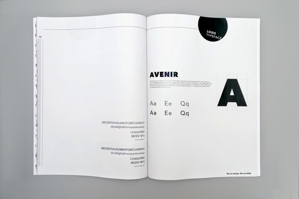
I like this interesting layout for branding guidelines, it is different to most which are publications, it looks very professional, and modern, it is also interesting how the colours invert, both work very well together.


https://www.behance.net/gallery/14532271/Buero-System


http://www.freytaganderson.com/work/adstream


Film 4 Off Air Guidelines


https://www.behance.net/gallery/1641514/Hello-Design-Conference-Brand-Standards-Manual


More professional and through guidelines from Benetton: The folder even represents the brand, the green is very striking.

http://new.pentagram.com/2011/06/new-work-benetton/

The guidelines inside the folder are very straightforward and simple, they are very effective. 


Easyjets guidelines are very true to their identity and they have covered the basics in which I can follow for my own guidelines.

Easy Jet guidelines


Their guidelines also included 'pictures' which a few of the guidelines I looked into didn't. I think that this may be applicable to my own identity as my design contains a certain style of images,


https://www.behance.net/gallery/15145931/AIGAs-Brand-Identity-Guidelines-(school-proj)


Further brand guidelines:

http://www.logodesignlove.com/brand-identity-style-guides

(all below from the website above)

  1. Adobe corporate brand guidelines (PDF)
  2. Alberta corporate identity manual
  3. Apple identity guidelines (PDF)
  4. Barbican identity guidelines (old)
  5. BASF summary of corporate design policy (PDF)
  6. Bath Spa University brand guidelines (PDF)
  7. Berkeley identity
  8. Best Buy brand identity
  9. Bitdefender brand guidelines
  10. Boston University brand identity standards
  11. Boy Scouts of America brand identity guide (PDF)
  12. British Council brand guidelines
  13. British Rail corporate identity manual
  14. Carnegie Mellon brand guidelines
  15. Channel 4 identity style guides
  16. Christopher Doyle identity guidelines
  17. Cisco logo usage and guidelines
  18. Code for America website style guide
  19. Columbia College Chicago brand identity manual
  20. Cornell University brand book
  21. Dropbox logos and branding
  22. Duke University style guide
  23. easyGroup brand manual (PDF)
  24. Edinburgh City brand identity guidelines (PDF)
  25. Esso Imperial Oil quick reference guide (PDF)
  26. Facebook brand assets
  27. Good Technology brand identity guide
  28. Google visual assets guidelines
  29. Haas School of Business identity standards style guide (PDF)
  30. Heineken company visual identity
  31. IEEE brand identity guidelines
  32. Jamie Oliver FRV brand guidelines
  33. Kew Royal Botanic Gardens brand guidelines (PDF)
  34. Liberty University brand identity policy
  35. Lloyd’s brand
  36. Macmillan identity guide
  37. MailChimp brand assets
  38. MasterCard brand center
  39. Microsoft corporate logo guidelines
  40. Mississauga’s Brand Story
  41. Mozilla Firefox branding
  42. NAMI identity guidelines
  43. National University of Singapore identity
  44. New York University identity and style guide
  45. NHS brand guidelines
  46. NYU-Poly identity style guide
  47. Ohio State University brand guidelines
  48. Ohio University brand standards
  49. Oregon State University brand identity guidelines
  50. Pacific University brand standards (PDF)
  51. Pearson logos and style guides
  52. Penguin logo guidelines
  53. Princeton University graphic identity (PDF)
  54. PRSA guidelines & logos
  55. Redfern brand identity guidelines (PDF)
  56. Saint Mary-of-the-Woods College style guide
  57. San Francisco International Airport identity program
  58. Santa brand book
  59. Skype brand book
  60. The Beano Comic brand guidelines (PDF)
  61. The Scout Association brand guidelines (PDF)
  62. The University of Texas brand guidelines
  63. Twitter brand assets and guidelines
  64. Ubuntu brand guidelines
  65. University of Arkansas graphic identity style guide
  66. University of California brand guidelines
  67. University of Cambridge identity guidelines
  68. University of East Anglia brand identity guidelines (PDF)
  69. University of Louisville brand graphics policy (PDF)
  70. University of Northern Colorado identity style guide (PDF)
  71. University of Wisconsin-Madison brand identity guidelines
  72. Vanderbilt University graphic standards
  73. Virginia Tech identity standards
  74. Walmart brand guidelines (PDF)
  75. Yale University identity guidelines
  76. Yelp styleguide

Brand guidelines should include most if not all of the following; (but its not limited to)

concept
logo & application
typography, number systems, leading, tracking, kerning.
colour selection
layout & grid
tone of voice
copy
web

Other things brand guidelines may include are:

logo & application
by-lines / straplines
product, range and distribution (methods, application)
advertising
audience
way finding
invoices and associated stationary

proposals


Thursday, 17 April 2014

The Shining

For Studio Brief 3 we where told our movie posters would be based on the actor Jack Nicholson. We where all given one of his films. I was given The Shining, 1980. 

Produced and directed by Stanley Kubrick, co-written with novelist Diane Johnson, and starring Jack NicholsonShelley DuvallDanny Lloyd, and Scatman Crothers. The film is based on Stephen King's novel of the same name, though there are significant changes.


Kubrick himself aided in modifying the Steadicam's video transmission technology. Brown states his own abilities to operate the Steadicam were refined by working on Kubrick's film. On this film, Brown developed a two-handed technique which enabled him to maintain the camera at one height while panning and tilting the camera. In addition to tracking shots from behind, the Steadicam enabled shooting in constricted rooms without flying out walls, or backing the camera into doors. Brown notes that
"One of the most talked-about shots in the picture is the eerie tracking sequence which follows Danny as he pedals at high speed through corridor after corridor on his plastic Big Wheel tricycle. The soundtrack explodes with noise when the wheel is on wooden flooring and is abruptly silent as it crosses over carpet. We needed to have the lens just a few inches from the floor and to travel rapidly just behind or ahead of the bike."
Film Stills


Film Posters for The Shining


http://www.alternativemovieposters.com/portfoliocpt/the-shining-by-ryan-black/

I then went on to watch The Shining, I had seen it before but it was a few years ago. There where parts of the film I had forgotten, and watching it gave me a better sense of the film.

Thursday, 3 April 2014

Logo Development Research

The definition of the word oneironaut is a dream traveller, initially I looked into the dream aspect of the word however, I did come up with some initial ideas but I felt that it was hard to visually represent this, and so I looked at the travel aspect, I mapped out what a traveller may need to travel, I found that I had wrote various navigational tools like a compass and a map. 

(scan in mindmap)

And so I searched navigation tools and this is what appeared. 

I came down to a compass and a gyroscope.


gyroscope is a device for measuring or maintaining orientation, based on the principles of angular momentum.

I felt that a gyroscope was interesting, it covered a lot of angles and the way it spins and connects suggests a meeting of realities (in my mind anyway) it also reminds me of the solar system and an atom, and so this is also what made me think of connotations of creation and realities. 


I also looked at a compass north,south,east and west facing with no indication of direction again it suggests a mysterious like state, again I liked the geometrical shapes involved in the drawings. 


I also thought about if the compass was distorted it suggests that something is off balance, maybe like a dream indication where something is slightly off it axis or a different size or colour to the norm, which is an indication by the brain.


Friday, 28 March 2014

Who is the Target Audience of Inception ?

The target audience of Inception is predominately aimed at young men between the age of 16-37 as its an action packed movie. However the plot and the idea both appeal to both genders.Campaign platforms are targeted at male market with the use of Empire magazine with 574,000 men reading it which has success written all over it.
-http://www.slideshare.net/zacology/audience-of-inception


-http://www.slideshare.net/SianLynes/marketing-of-inception

“Your Mind Is the Scene of the Crime.” tagline

'The Mind Crime Game'
https://www.youtube.com/watch?v=kYjDEP-bId4

http://www.mind-crime.com

Firstly a trailer was released in August 2009.
(Revealing the genre of the film, sci-fi action thriller)
Also a basic website was set up at this point too.
‘Clues’ where drip fed through this site revealling a little bit more each update.
After targeting the online market, posters where displayed that warned the audience of dream theft and its illegality. 
Internet ARGs (Alternate Reality Game) and phone apps where then unveilled.
Near its release an official site was created, and many extras where made available, such as; a synopsis, cast and filmaker information.
The ‘Mind Crime Game’ - a virtual world , which also encouraged the audience to create thier own film poster.
Facebook
Another downloadable app ‘SCVNGR’ encouraging the user to check over 100 locations for clues to unlock more content and share thier progress.

30 second TV commercials where also aired, showing the significance of Ellen Page’s character.