Tuesday 19 March 2013

Feedback on Komodo Dragon Layout

In the design principles session we presented a layout we had done. I chose my indesign layout of the komodo dragon as I wanted to gain feedback on it. 


I recieved three pieces of feedback 

1. Good use of negative space, like how the image bleeds onto the opposite page 'komodo snorkling adventure' subheading, maybe have it above the body copy for text hierarchy.  

2. Good use of negative space.

3. Love the heading font eye-catching amongst the photos. Think the photo overlapping the page works well because it makes both the pages look related to each other.

The first and third pieces are constructive pieces of criticism, which I find will be helpful.

Present the findings (Layout Terminology)

Our Question

What is a dps ? 

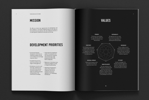
A dps is a double page spread, a double page spread is ... 

a layout that covers two facing pages in a magazine or newspaper. If such a layout is featured in the center of the magazine or newspaper, it is called a center spread.

In advertising, double-page spreads are very costly and are usually used only when the advertiser is making some special announcement, such as the introduction of a new product, or a new brand promotion. 

A double page spread can be flat or more interactive, e.g. pop up. You can also arrange any kind of content and produce interesting layouts. 

Others 

Margin ? 
margin is the area between the main content of a page and the page edges.The margin helps to define where a line of text begins and ends. When a page is justified the text is spread out to be flush with the left and right margins. 

Gutter?
A space between printed columns of text.

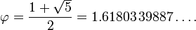
What is a golden section ? 
The golden ratio (\varphi) is also called the golden section or golden mean.


In page layout terms


What is pagination ? 
Splitting up of the pages and numbering them. Encompasses rules and alignments for deciding where page break will occur. Also need to consider cultural differences.

A subheading? 
Finer detail quicker, longer than a heading. And represent topics of the heading.

Paragraph ? 
Consists of one or more sentences 

Caption ? 
Draws in the reader, gives context to the image on the page.

Ligature ? 
One character connected to another i.e . fi fl ae , used in typographical terms can be used to create a more attractive letterform. Represents specific sounds or words. 

Pica ?
pica is a typographic unit of measure corresponding to 1/72 of its respective foot, and therefore to 1/6 of an inch. The pica contains 12 point units of measure. 
12 points in one pica , 3 types of pica, P/2.
Publishing applications such as Adobe InDesign and QuarkXPress represent pica measurements with whole-number picas left of a lower-case "p", followed by the points-number, for example: 5p6, represents 5 picas and 6 points, or 5½ picas.

Pixel?
A sample of an original image. A dot or a square, each is made up of 3 red green blue. Smallest element. 
8 bit - made up of 8 colours ? 

Drop Cap  ? 
From bibles and old books. A large Capital that was illustrated. Signifies the start or break in the text. 

Folio Numbers ? 
Normally the numbers at the bottom of the page. 

Box ? 
A square format layout can contain text image or both.

Rulers ? 
Measurement rulers in software, where your guides are on the page, shows the page measurements at actual size.

Greeking ? 
Greeked text is used in typography to evaluate a certain typeface's appropriateness, overall style or type color. Because a viewer can be distracted by meaningful content, greeking unimportant text forces the viewer to focus on layout and design.

Greeking is also used when a design is being developed but the content is unfinished. One example might be the layout of a magazine article which has photographs but no text; initially, a lorem ipsum text is used, and then the nonsense text is replaced with draft versions as they become available. This allows design and layout to be carried out in parallel with content revisions.


Wednesday 13 March 2013

Ten Things- Layout Research

I looked at some more layouts too help inspire my own double page spreads, for ten things you need to know about graphic design. 
I looked at examples I found inspiring and that I liked aesthetically.
 Alexander Zhestkov

 Alexander Zhestkov
Audiofly Headphones by Brett Layton, via Behance

Casa da Música Programme Book by Sara Westermann on Behance
http://proekt.co.uk

http://proekt.co.uk

http://proekt.co.uk

http://proekt.co.uk

http://proekt.co.uk
http://pinterest.com/pin/257057091202906791/

http://pinterest.com/pin/257057091202906791/
Nude Design Studio, Australia

Nude Design Studio, Australia

http://www.behance.net/gallery/I-Love-Bodoni/1277123

http://www.behance.net/gallery/I-Love-Bodoni/1277123

http://www.behance.net/gallery/I-Love-Bodoni/1277123
INFLUENCIA N°3 - LA MOBILITÉ

INFLUENCIA N°3 - LA MOBILITÉ
http://studiobaer.com

http://studiobaer.com

http://studiobaer.com

http://studiobaer.com

Designer: Kyle White

Designer: Kyle White


Tuesday 5 March 2013

Ten things you need to now about Graphic Design


1. Colour Theory is just as valuable, if not more so than typography, colours aren't just as simple as red, blue and green. There is a spectrum of thousands of colours and they have a variety of properties, feelings and meanings. Primary, Secondary and tertiary colours add to this spectrum.

http://colormatters.com

"Color plays a vitally important role in the world in which we live. Color can sway thinking, change actions, and cause reactions. It can irritate or soothe your eyes, raise your blood pressure or suppress your appetite. When used in the right ways, color can even save on energy consumption."

http://colormatters.com/color-symbolism/global-color-survey

Even blogs that show the importance of colour and the world around us: 

http://www.colormatters.com/color-matters-blog
Shoes and Hues 
Posted by Jill Morton on in Blogs & News
Pink: The Color of Shock and Awe - Olympics 2012 
Posted by Jill Morton on in Blogs & News
Is color the key to weight loss?
Posted by Jill Morton on in Blogs & News

One particular article caught my attention as it really highlights my argument...

A Color that’s Worth $80,000,000
Posted by Jill Morton on in Blog Archive


"The right shade of blue can be worth $80 million – at least that’s what they say about Bing’s blue link color. Microsoft’s research team found that blue engaged people the most and they tested various shades of blue in user groups. First, they determined that their previous shade of blue (a paler hue) lacked confidence. Finally, they wound up with a shade of blue quite similar to the one used by Google. Based on user feedback, the team estimated the best blue color could generate $80 million to $90 million in ad sales."

http://pinterest.com/pin/402438916672044409/

http://pinterest.com/pin/402438916672044408/

http://pinterest.com/pin/402438916672068616/


2. You must have a detailed understanding of a letterform, so that you can manipulate and make a new font and understand why there is a difference between each type face. The anatomy of type. 


3. "Type is Speech - made visible", you need to know as much about type as possible in order to get the most successful communication/feeling of a message, and to give your piece a dynamic and interest. This is why we have different fonts.  

http://www.typotheque.com/articles/interview_with_peter_bilak_milanohttp://ilovetypography.com/2008/03/21/extreme-type-terminology/http://ilovetypography.com/2008/04/04/on-choosing-type/

http://pinterest.com/pin/213146994836336683/

http://www.dailydropcap.com -Jessica Hische

Abbie Poles, http://www.typographyserved.com/gallery/Christmas-Card-Collection/5764557


4. Type must always be readable and legible,(unless it is intended) or else your message will not be clear and you wont communicate.


http://pinterest.com/pin/267893877804083447/


David Carson, by ink insurgent
Legibility - Matt Chase
http://pinterest.com/pin/254523816411311616/
http://pinterest.com/pin/111534528241953422/

http://pinterest.com/pin/120189883776311020/
http://pinterest.com/pin/50032245830044190/
http://pinterest.com/pin/47498971040854068/


5. We must understand colour, as we also need to understand the print process. Understanding colour means we will be able to make the most cost and time effective decisions when it comes to print. CMYK print RGB screen. This is because CMYK is i subtractive and RGB is additive, it makes a difference.


http://pinterest.com/pin/402438916672044414/


Printing with Pantone Colors and Spot ColorsOrdering commercial print can be a lot like deciding how to decorate your living room. Finding the right balance of color and texture to achieve the look you want can be a daunting task. When it comes to color especially, you may need multiple passes, whether of paint samples or digital design versions, to get the color just right. Knowing what you're trying to achieve and the principles of color production can help you save time and frustration when it comes to your choice of ink on that important print project.
The biggest choice you will need to make when it comes to ink is whether to use spot colors (Pantone Matching System®) or CMYK process printing. Understanding the difference between the two "color systems" and when you should use each is the key to making it an easy choice.CMYK vs Pantone: Printing Processes DemystifiedWhen preparing an image for printing in CMYK, the electronic file is separated into four primary colors: cyan, magenta, yellow and black. The image is recreated using screen tints made up of small dots that are applied at different angles to the four process colors. The separated color images are then transferred to four different printing plates on the press. The colors are then printed one after the other to recreate the original image. The CMYK colors are manufactured colors and are not mixed by the end user. This method can be referred to as 4 color, full-color or standard process printing.

cmyk colors

CMYK or cyan, magenta, yellow and black inks used in process printing

The PMS system, on the other hand, uses pre-determined, published color formulas to create a large number of ink colors. PMS stands for Pantone Matching System®, and is a standardized color reproduction system. Similar to the paint swatch guides you find at your favorite paint store, the pantone color chart contains thousands of color swatches created from a palette of basic colors. Creating a Pantone spot color is similar to mixing paint such as blue and yellow to get green, but with much more precision. Each color has a 'PMS' number assigned to it. These numbers are used to identify the exact color needed. The specified ink is then prepared using the correct mixture of base colors, either purchased pre-mixed from an ink company or mixed on-site at the printing company. Using PMS inks is called spot color printing.

pantone color chart

A selection of colors from the Pantone color chartGet it Right: Benefits and Drawbacks of Printing with PantoneColor is very subjective, which is why the Pantone Matching System® works so well. It takes all the guesswork out of color identification. Every computer monitor is different, every printer is different. By standardizing the colors, manufacturers and customers in different locations can all refer to the Pantone system to make sure colors match. It is used by many printers and graphic artists to deliver reliable, reproducible colors to their customers. The ink manufacturers who create the base color inks are strictly licensed by Pantone for color accuracy.Why PMS Isn't Always KingEven though Pantone is a great option in certain cases, it doesn't always make sense to incorporate it into your printing project. Using spot colors can be more expensive than process inks due to the extra production costs involved in "washing up" and changing out the ink in the press, particularly when using more than one or two PMS colors depending on the printer's manufacturing equipment and processes. Since CMYK process printing uses the same base colors all the time, it's a more cost-effective solution.When Spot Colors Should Reign SupremeThere are certain times in commercial printing when your colors have to be exact. That's when you should consider using PMS colors, either on their own or added to standard four-color process printing. Here are a few examples:
  • Consistent Branding/Logos
  •  - Think McDonald's red or UPS brown. Using PMS colors for your logo and stationery will allow you to ensure color accuracy and establish a standard that anyone working with your artwork will be able to match.
  • Colors outside the range of CMYK
  •  - There are some colors that just can't be produced with CMYK, including colors such as navy blue or bright orange.
  • Color consistency from page to page
  •  - If you are printing a booklet or catalog where you need a solid block of color to be consistent from page to page, it might be worth using Pantone. When printing a solid color with process inks, slight variations in the color balance can affect the consistency of the color.
  • Smooth coverage of large areas
  •  - A PMS color works well when the consistency and saturation of large areas of a solid ink color is important.
As you can see, there are a variety of things to consider when decided whether you should use PMS colors or stick with four color process printing. It's important to look at each project individually and weigh all the factors to come to an informed decision.

http://www.printingforless.com/Pantone-Colors-in-Printing.html

http://pantone.co.uk/pages/pantone/colorfinder.aspx


6. As well as this above according to Itten there are 7 colour contrasts which are the way in which we can read and differentiate colour

• Contrast of TONE
Formed by the juxtaposition of light and dark values. This could be monochromatic
• Contrast of HUE
Formed by the juxtaposing of different hues. The greater the distance between hues on a colour wheel, the greater the contrast.
• Contrast of SATURATION
Formed by the juxtaposition of light and dark values and their relative saturations
• Contrast of EXTENSION
Formed by assigning proportional field sizes in relation to the visual weight of a colour. Also known as the contrast of proportion. 
• Contrast of TEMPERATURE
Formed by juxtaposing hues that can be considered ‘warm’ or ‘cool’. Also known as the contrast of warm and cool.
• COMPLEMENTARY contrast
Formed by juxtaposing complementary colours from a colour wheel or perceptual opposites.
• SIMULTANEOUS contrast
Formed when boundaries between colours perceptually vibrate. 


Colour is based on an interpretation of contrast, one thing being different to another. Variations come in the degrees of difference.

All contrasts are happening at the same time, greater or lesser extent.


7. We must understand the meaning of Semiotics, the use of a symbol being the sign for something, which signifies a particular feeling/ objective.


Semiotics is a key tool to ensure that intended meanings (of for instance a piece of communication)  are unambiguously understood by the person on the receiving end.

Semiotics is an investigation into how meaning is created and how meaning is communicated. Its origins lie in the academic study of how signs and symbols (visual and linguistic) create meaning.


Sign
Is any objectaction, event, pattern, etc., that conveys meaning. It can also bea conventional or arbitrary mark, figure, or symbol used as an abbreviation for the word or words it represents. Or it can be a motion or gesture used to express or convey an idea,command, decision.
Symbol
Is a wordphrase, imageor the like. A complex system of associated meanings which are perceived as having inherent value which can be separable from that which is symbolised, as being part of that which is symbolised, and as performing its normal function of standing for or representing that which is symbolised: usually conceived as deriving its meaning chiefly from the structure in which it appears, and generally distinguished from a sign.Signifierperson or thing that is made known by signsspeech, or actions. It is also meant to be a sign of or have meaning.Aswell as this it is the configuration of sound elements or other linguistic symbols representing a word or another meaningful unit in alanguage.


http://pinterest.com/pin/75927943689909822/


8. To be visually literate. All visual communication is based upon an agreed set of signs,symbols, gestures and objects. And we need to consider what these are and how they are affected by audience, context, media and distribution.


What’s trendy
http://randomwire.com/cultural-differenceshttp://www.yangliudesign.comhttp://www.elainer.com/2010/06/the-fundamental-cutural-differences-between-east-and-west/
In Japanese and Thai culture the colour white signifies purity, while in China it signifies funerals and mourning and should be avoided.
Eastern culture basically has a collectivist orientation while western culture basically has an individualist orientation. For easterners the family, community, and/or organization comes first before the individual. Protecting an individual's dignity is often equated to protection of family or organizationl dignity.


http://boards.straightdope.com/sdmb/showthread.php?t=654739


In fact, China has a lot of unexpected symbols. You can easily break up a friendship by buying someone a watch or a nice pocketknife (clocks symbolize death, knives show a wish to cut off the friendship). If you give your girlfriend a bunch of white daisy's, she'd probably be baffled and offended (white flowers are for funerals). 

Differences in cultures ticks,crosses, circles:


1.I came across a subtle example of this recently in the Facebook user interface.

Facebook crowdsources place data and translations for strings in its user interface from ist user base. In certain dialogs there is a provision for the user to vote whether e.g. a suggestion for the name of a place, or a suggestion for a translation is correct or not.

The site uses buttons with a check/tick mark (✓) for "vote for correct" and a cross mark (x) for "vote for incorrect", but without explaining the meaning of the buttons as apparently they are considered obvious.

Only, e.g. here in Germany it is not obvious - the check mark does carry a meaning of 'correct' but the x does not to my knowledge carry a meaning of 'incorrect'. In a form, putting a ✓ or an x into a box means the same thing: 'yes/this applies'.


2.In Spain the tick mark isn't frequently used (to the extreme where most people can't even figure out what to call it when it appears in a computer program), and the X can be positive or negative, it's not an automatic "bad". The act of putting ticks or other marks on a list to mark checked items does have a consistent name, the mark itself doesn't: my American coworkers were quite surprised when they saw us "tick" the same list three times against three different comparison lists: the first time, \; the second pass, / (making X); third pass, circle the X.


3.I spent 9 years in an international school where, when grading tests, ✓ stood for "correct" and x for "incorrect". However, In Finnish schools, grading tests or exams is done by marking % for "correct" and ✓ for "incorrect" (actually, I think it's more of a V for väärin or wrong, but the same shape anyway). This led to some initially very disappointed young girls when I was substituting as an English teacher at a Finnish elementary. "

4.In Japan too, a tick ✓ means "incorrect", so that led to great confusion when I was marking papers at first, too. Correct is symbolized by a circle O, and in many cases when a teacher just wants to indicate that they have seen a student's work, it's a great big circle over the whole page. If an elementary kid has done well the teacher will embellish the circle into a flower and call it a "hana maru" which is greatly sought after as a sign of high praise. But as a kid I'd have been livid if my teacher had scribbled all over my work!!

http://www.informationisbeautiful.net/visualizations/colours-in-cultures/


9.Before you can apply a grid you must understand the purpose its for. And then you can set its rules e.g. margins, columns, gutters.

http://www.malanenewman.com/glossary_graphic_design_terminology.html

Layout Design - Refers to services involved in creating a structure to the page that holds all the necessary parts in an organized and effective way. -http://www.firelightwebstudio.com/index.php


10. A lot of design work (editorial) uses a grid, there are many variations of the grid and each have their own rules and principles, you should use a grid to create a neat layout.
Fibonacci sequence, canon , rule of thirds.