Katy Perry related websites
 |
| (The old website which has now changed to the one below) |
The original site I looked at was to me quite tacky. There was so much going on on one page...
Firstly one of the most distracting things about the page is the sunflowers down either side. They are too bright and distracting, and just unnecessary. Then the colour scheme changes to a pink and purple, which to me clashes. The type in the menu bar looks blurry and the font itself is too handwritten looking. It also looks as if its disappearing, but this could be down to a choice in colours.
There is also a lot of information present on just this homepage alone. Theres a video, a tracklist with audio information, a menu bar, social media links, a title (which is almost lost in the image), 4 seperate images, 3 of which are the same, a album title and download button.
This is too much for one page it needs to be simplified.
 |
| http://www.katyperry.com |
However when I returned to the site two days later it had changed due to the release of her new album, Prism. I really preferred this new site. I feel that is laid out neatly, the type is much more modern and importantly legible. There is also a very simple but effective play button. The only thing that is missing is a menu/navigation bar, and I think that this could of been put along the bottom of the title in the top left, neatly and successfully. I guess without this the site isn't really an explanation of what its content is.
However less successfully is the content , which is there when you scroll down ( there is no indication to scroll) the triangles format doesn't work, there is too much white space, and the images do not fit into the triangles very well. There is also too much space in between the subtitle and its copy. Its quite off putting.
This is a map on one of the pages of the site, I just like the concept, its still clearly the world. I also like how the type fits nicely in the diamond on the page. I do think its a bit dark though, there is a lot of black.
This is a separate fan website that I found, it's too black and white, its un engaging and I think that the target audience would just switch off. The format is boring and its nothing different.
The two sites above are very girly, the layout is a heavy block of copy and then a small square gallery. The block of text is off putting. Both the titles are in a scrip-tic font, I think this is to enhance a sense of girly, except I think that its too formal and quite old looking. The colours are stereotypical too. And again there is an overload of un relevant images.
Websites related to a similar target audience...
On google I had searched Katy Perry and to get a feel for her target audience or similar audiences I looked at what other people of the same audience had being searching. And so I Iooked at these websites and analysed them, for their function/ form and the audience.
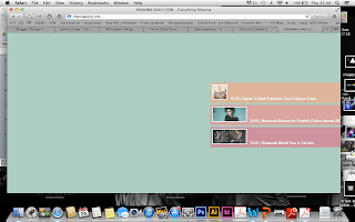 |
| http://rihannadaily.com |
This site took a while to load and this is very off- putting for the audience and it will not capture their attention, and they will probably move on to the next site.
 |
| http://rihannadaily.com |
I think that this site for Rihanna really does nothing for her. I think its very un relatable. The colours don't look good together, especially on screen and they do not suit her image, which is more sexy and urban. None of the fonts correlate to each other, they clash and I especially do not like the font for 'Rihanna Daily.' ( center, left ) I think it looks too childish. I also do not think that the 3 bars coming in from the left are appropriate, they do not need to be there. the image should just be smaller and the menu bar moved up about 100/200 pixels or so, and that way you could see all the options anyway.
 |
| http://ladygaga.co.uk |
When I went on this site firstly this window popped up, its instantly selling, which can be a good thing, I could consider this. It's better than a landing page as you can still see a bit of the site behind it and so you know you are in the right place. However a pop- up is usually seen as an annoyance and a user might just go straight of the site.
 |
| http://ladygaga.co.uk |
I do not like how the menu bar is all squashed up to the left, its like it goes horizontal and vertical it should do one or the other, not both, its confusing. I'm not too sure why there is a big black bar across the top of the page. I think that the colour scheme is quite simple and it does help navigation, and relates to the image in the background. I'm not sure if it relates to her as an artist very well though, she is more eccentric and dramatic, I feel that this lets her down.
Now coming back to this post, I found that the Lady Gaga site had changed as well.
 |
| http://ladygaga.co.uk |
I feel that this site is more improved in comparison to the previous one above. The title fits better with the menu bar and you can see it a bit better, however it still should be vertical or horizontal. I like the background image and the overall colour scheme I feel that it fits better with the artist and its more engaging, there isn't so much white/ tones of white.
 |
| http://taylorswift.com |
The first word that comes into my head with this site is boring. It is very dark the image is looking away its small, and it doesn't do or say anything. The pop up along the bottom of the screen is just in the way it is distracting and its almost overwhelming, and it shouldn't be there. I think another issue with this site is there is too much negative space in one half and then lots of type in another. I do quite like the menu bar, it is accessible and clean, but as you can see I have looked at this last and so there is almost too much noise on the page to even begin to look at the menu bar.
 |
| http://www.britneyspears.com |
When I went onto the Britney Spears website, I firstly arrived at a landing page, and I had to scroll down to a button which said enter site. I think that this would usually make someone just move on, and I wasn't actually aware that wasn't the site when I was looking at it, below is the site...
 |
| http://www.britneyspears.com |
I quite like the simplicity of this website. However does the simplicity take away from the accessibility ? I think that there is a fine line between the two. And its a case of if you want to know you will find out. But if you are trying to attract new fans/ customers you need to be aware they might have just stumbled on this site on a whim and may just move on due to a lack of basic information. The image is very striking though and it does fit quite well with the title. I do think that they could of been a bit more experimental and placed it of centre for example.
 |
| http://www.mileycyrus.com |
This sight just screams tacky and cheesy. I am not sure if this is a purposeful aim of the site, or whether it is almost meant to look like a teenage girls blog. I find it pretty awful to look at and I would just move onto another site. There is no particular layout, it is hard to navigate as there are no options or menu bars. There isn't really anything except the title 'Miley Cyrus' and the words ' Buy ! Buy ! Buy ! ' which to me says there is only one purpose of this site and it is to sell, which is to me seems very capitalist and consumeristic. The words 'buy,buy,buy' just remind me of a bargain store. In your face and tacky. I think the site should have other information on it too.
 |
| http://www.justinbiebermusic.com |
Firstly I really like the name of Justin Bieber's site, 'music' really defines what he is famous for and what is his main talent, I think that this is a good idea to take forward in my own site, a specific focus. Also on the site you arrive at an artwork timeline and when you click on it a drop down menu icon appears and then the artwork comes up with its title and the availability to buy it online. However when I first saw the timeline it did not fit correctly on the screen, the shot below is zoomed out, but I think it is much more effective to view it all in one. I like this time line idea, and the ability to buy/ download it. This is obviously something a similar audience appreciate and use.
 |
| http://www.justinbiebermusic.com |
 |
| http://www.brunomars.com |
I think that the Bruno Mars site is to simple there is no menu options, and it is not evident that you have to scroll down the site until you see the small arrow in the bottom right corner. I also think that the photograph in the background is to zoomed in. And I just find it un- engaging. Although it does have the 'download from iTunes' icon again like the Justin Bieber site.
 |
| http://justintimberlake.com |
I think that the Justin Timberlake site has a more mature aesthetic, perhaps appealing to a slightly older audience, however I do find it verging on boring/ uninspiring, I like how the picture is facing away almost as if you are having to follow him, but I think that the setting is completely wrong , it says nothing about why Justin Timberlake is famous. I also find that the layout is wrong. As the title is centrally aligned and the other copy is left aligned, it should be one or the other. And the brightness of the words is throwing of the type hierarchy, as the small play icons in the top right are as bright as the title, which draws your eyes to that top left corner, and no where else, I think that the play buttons should be below the title to draw the eye down, if they are that important. They are brighter than the actual options, I feel that this is really off putting. And you can barely read the copy at the bottom left it is illegible due to the image. I think that the colours are kind of dark and do not fit the purpose of the site.
 |
| http://selenagomez.com |
I like the menu bar I think that it is really simple and modern, the white really stands out, however the image underneath is really kind of tacky, and it does not work well with the menu bar, I also do not like how the images at the bottom of the screen are just creeping onto the page, it draws your eyes straight down as it isn't really supposed to be there. Again the in the image there is too much text and it just diverts the eyes all across the screen it is almost like information overload.


We do web research to gather information using internet, and since everyone has their internet then it is an easy job but still requires attention and focused.
ReplyDelete